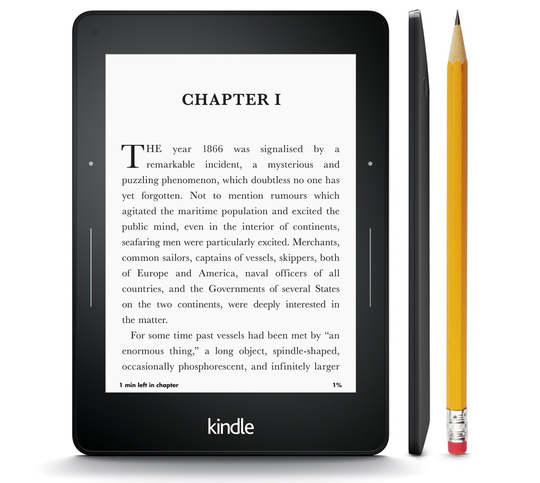
Amazon has expanded its Kindle eReader range by unveiling its 7th generation Kindle. Supplanting the second-gen Paperwhite as Amazon's premium eReader, the Kindle Voyage is billed as the company’s most advanced eReader yet, coming in lighter and thinner than any previous model and sporting a more advanced display and user interface.
Like previous models, the Voyage will be offered in Wi-Fi only and Wi-Fi + Free 3G variants, both with or without "special offers" – or ads as they're more commonly known. There's 4 GB of onboard storage, with free cloud storage of all Amazon content included as per usual. The device fully charges via USB from a computer in around three hours, with the charge lasting up to six weeks, depending on usage. Both variants measure 6.4 x 4.5 x 0.3 in (162 x 115 x 7.6 mm), with the Wi-Fi model weighing in at 6.3 oz (180 g) and the 3G model weighing 6.6 oz (188 g).
The weight savings over previous models are in part due to a new magnesium back that is paired with a flush front made up of a specially strengthened scratch-resistant glass with microetching to reduce glare and provide a paperlike feel. Behind this is a new 6-in Paperwhite display built on Carta e-paper technology that boasts 16 levels of gray scale and packs 300 pixels per inch (ppi) – the highest resolution of any Kindle eReader to date.
Amazon says it also has higher contrast and boasts a 39 percent brighter front light that automatically adjusts to the surrounding light and can be adjusted by the user. This "smart" light is also designed to change brightness over a period of 30 minutes when the user reads in the dark to keep pace with the reader’s improving night vision.
Another new feature introduced in the Kindle Voyage is Pagepress, which is a bespoke force sensor in the bezel of the device. A light press of the thumb on the bezel turns the page, while a slight vibration tells you it’s been done. Both the level of pressure and amount of haptic feedback can be customized by the user to ensure it isn't too distracting.
"Our mission with Kindle is to make the device disappear, so you can lose yourself in the author’s world,” says Jeff Bezos, Amazon.com founder and CEO. "Kindle Voyage is the next big step in this mission. With the thinnest design, highest resolution and highest contrast display, reimagined page turns, and all of the features that readers love about Kindle – books in seconds, no eyestrain or glare, readability in bright sunlight, and battery life measured in weeks, not hours – Kindle Voyage is crafted from the ground up for readers.”
The Kindle Voyage is available for pre-order now, with the Wi-Fi model with special offers priced at US$199 and the 3G model priced at $269. Getting rid of the special offers adds $20 to the price of each model. The devices are scheduled to ship in October.
Source: Amazon