Architecture

Statoil's Norway HQ: one of the best offices in the world?

Statoil's Norway HQ: one of the best offices in the world?
Statoil's new Norway offices (Photo: A-Lab)
View 10 Images
Statoil's new Norway offices (Photo: A-Lab)
1/10
Statoil's new Norway offices (Photo: A-Lab)
Statoil's HQ's Oslofjord locale (Photo: A-Lab)
2/10
Statoil's HQ's Oslofjord locale (Photo: A-Lab)
The HQ is aluminum-clad inside and out (Photo: A-Lab)
3/10
The HQ is aluminum-clad inside and out (Photo: A-Lab)
The atrium at Statoil's HQ (Photo: A-Lab)
4/10
The atrium at Statoil's HQ (Photo: A-Lab)
Aluminum and wood stairs (Photo: A-Lab)
5/10
Aluminum and wood stairs (Photo: A-Lab)
Break-out space in the HQ's atrium (Photo: A-Lab)
6/10
Break-out space in the HQ's atrium (Photo: A-Lab)
The atrium at Statoil's HQ (Photo: A-Lab)
7/10
The atrium at Statoil's HQ (Photo: A-Lab)
The HQ's walkways and stairways create abstract interiors (Photo: A-Lab)
8/10
The HQ's walkways and stairways create abstract interiors (Photo: A-Lab)
Statoil's HQ in plan (Image: A-Lab)
9/10
Statoil's HQ in plan (Image: A-Lab)
A section through Statoil's HQ (Image: A-Lab)
10/10
A section through Statoil's HQ (Image: A-Lab)
View gallery - 10 images

Is this one of the world's best office buildings? These are the new offices of Norwegian oil and gas outfit Statoil, built at Fonebu near Oslo in Norway. The building was lauded well before its completion towards the end of 2012. In 2009 it was singled out as Future Project of the Year at the World Architecture Festival. Last year it received the Best Commercial Building prize at the World Architecture News Awards, and more recently was nominated in the Best Office & Business Development category at this year's MIPIM real estate exhibition in Cannes (where it was beaten by The Squaire in Frankfurt). So what's significant about the design?

Instead of designing a single mass, Norwegian architects A-Lab conceived an office composed of five aluminum-clad tubes, arranged horizontally in an almost slapdash pile. It may not be the most efficient use of space, but then situated near to Oslofjord it's not as if space is at a particularly high premium.

The arrangement brings with it certain inherent advantages. First, each of the five blocks has a unique orientation and view. And the space between the five blocks creates an atrium, covered by an undulating propeller-shaped glass roof. In line with popular management theory, the building is planned so that workers are ushered through the atrium as they come and go, cultivating the sort of chance encounters that we're now constantly told cultivate innovation.

The atrium at Statoil's HQ (Photo: A-Lab)

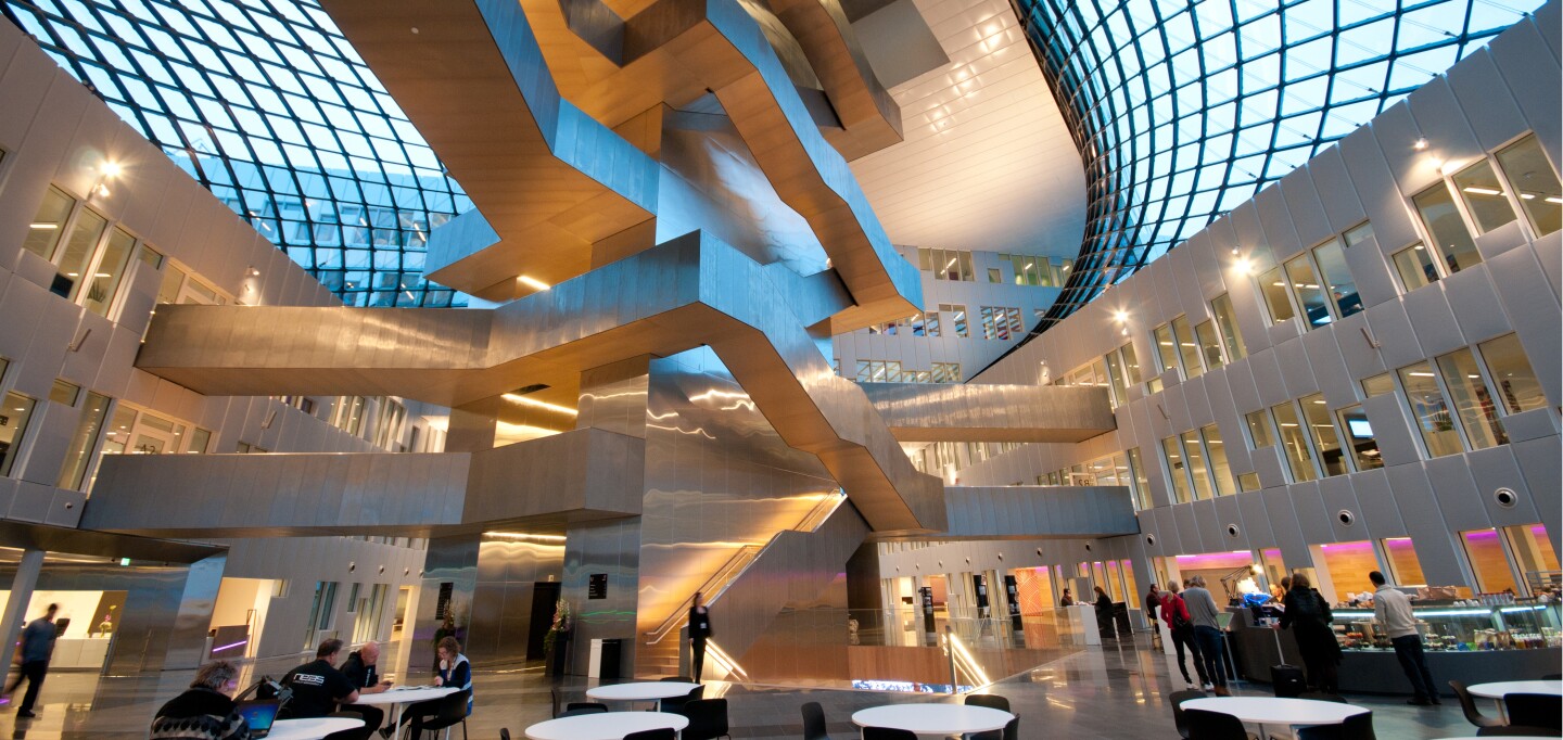
Perhaps more to the point, it's really a rather nice atrium, with a striking aluminum stair tower at its center. Square-spiraling around a core, the stairway branches off this way and that, contorting like something M. C. Escher might have contrived.

A-Lab reports U-values (which are rates of heat transfer) of 0.8 W/m2K for the windows, 0.18 W/m2K for the rest of the facades, and 0.8 W/m2K for the roof. The figure for the roof is high – the cost of doing business where atria are concerned, but which may be offset by other advantages such as increased scope for natural ventilation. (For context, the admittedly exacting Passivhaus standard calls for an overall U-value of 0.15 W/m2K.)

But it all boils down to the building's eventual energy-consumption which A-Lab estimates will be 103 kWh/sq m/year, which it describes as "unusually low." Provided that covers both electricity and heating (supplied via an 85-percent efficient district scheme), that's putting it mildly, falling comfortably inside the Passivhaus requirement of 120 W/m2K.

As offices go, Statoil's HQ certainly has game. But missing from the press shots we've seen is an idea of how things are inside the office spaces themselves. You can't judge an office until you've worked in it … or at least seen some pictures. But it would very strange indeed if the HQ's abstract circulation spaces led to drab office cubicles. It seems unlikely.

Source: A-Lab, via Dezeen

View gallery - 10 images
9 comments
9 comments
myeo
The surface area and perimeter of the modular sections is a waste of material and represents an unnecessary high cost (a square box would require a lot less material). I understand this site obsesses with vanity, but I am a firm believer of "more is less."
Fairly Reasoner
The answer is, "no."
piperTom
In my experience, the word "striking" in architecture means it looks good in the architect's model, will impress a visitor during his first half hour, and is otherwise a huge waste. I see nothing in the pictures here to change my opinion.
Building should be designed to be occupant friendly first, efficient second, and pretty (distant) third.
Stein Varjord
From my windows i look west across about 800 meters of water to Fornebu, where this building in the center of a quite nice view. It's not the prettiest building I've seen, far from it, but it's way better than most office buildings. My words would be "very cool design". Inside is also quite a nice place to visit, but I've never worked there.
I was born 1960, so I remember the times when "functionalism" (NOT the "Funkis" from the twenties and a bit) was the prime excuse for building cheap ugly shit that efficiently killed off all pleasure of existence in their vicinity. If they could simultaneously tear down an older nice building, they would be overjoyed. Murderous dictators Stalin and Nicolae Ceucesku were probably the heroes of these architects and builders. The people that decided things until about twenty years ago are luckily mostly dead. I hope such a very bad culture will stay dead for a very long time.
I wonder if "piper Tom" and "Myeo" are actual ghosts of that destructive time, or if they just haven't thought much about what opinions they present. I really hope you are very alone about your thoughts, if indeed they can be called thoughts...
Finally: Some correction to the article itself: Quote: "It may not be the most efficient use of space, but then situated near to Oslofjord it's not as if space is at a particularly high premium." Norway is a quite big area where quite few people live, so there is a lot of space, but this is also a very rich country and this building is in an area that is very attractive, so property prices are high, compared to most other cities.
myeo
@Stein Varjord I wasn't expecting my comments to be compared to "Stalin" or for someone to state: "I really hope you are very alone about your thoughts, if indeed they can be called thoughts..." Insulting my intelligence likely isn't the best way to sway my opinion.
I merely dislike how people obsess with vanity (particularly on this site). The layout of the building and the triumphant nature of its construction appear to be an over improvement and possibly a source of functional obsolescence. Good design should be about the balance between utility and enjoyment.
The article discusses how the building is "green" due to its low use of energy, but it seems ironic to me that they used so much material to build the structure in the first place.
Just my "two cents". No name calling or intelligence bashing on my part. To each their own.
Vladimir Popov
@Stein Varjord What would you know about Stalin? Another Wikipedia armchair warrior...
felix_
Nice article. I appreciate the numbers on energy.
Marc 1
Well, I like it. It may not be the first word in efficiency - but it is different, striking non conformist and still relatively efficient.
The Kid
I believe some countries, perhaps Norway, has a requirement that desks can only be so far from a window. That kills the big square buildings and leads to narrower, loner structures. This is certainly an interesting way of stacking up floor space.